

We all know how important visuals are when it comes to communication. They are just easier to understand at a glance and offer better understanding compared to walls of text. It is also really good for the eyes, especially if you are presenting to an audience.
Teachers, business owners, and other professionals use visual tools all the time. But the manual labor of typing, dragging stuff on the screen, resizing, layout design, and choosing the best color combination is not something many of us like doing. It is usually a time-consuming process and sometimes does not end up being effective.
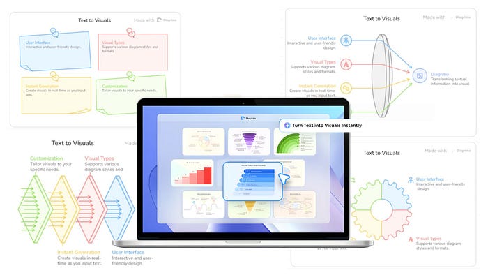
Today, AI models have improved to be capable of transforming a piece of text into a high-quality visual component within seconds. Check out this example report in text format transformed into a stunning illustration with an AI tool called Diagrimo.
Pretty cool, right? In this guide, I am going to show you the exact workflow for turning your text data into high-quality illustrations in seconds.
Let's get started.
What is Diagrimo?
Diagrimo is an AI-powered tool that instantly turns your ideas or text into clear and structured visual diagrams. It helps you organize thoughts, plan projects, and present concepts easily in one place.
It uses AI to understand your text and automatically create the right diagram. It can make a fishbone, flowchart, or pyramid chart depending on what fits your data. It also enhances your writing with tools for grammar correction, tone adjustment, and translation, which makes it a complete writing and visualization assistant.
How to Create Beautiful Diagrams with AI
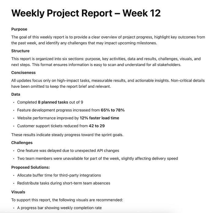
The first thing you need to do is to create a Diagrimo account. Once you are in the dashboard, create a new project, and this is what you should see on your screen.
Before the AI agent is able to create a visualization, it needs some data to analyze. Feel free to try out the sample prompts provided by the tool to get a feel for it. But the real magic happens when you use your own data. You can feed it company information, sales reports, meeting notes, or discussion points.
Pro tip: If your text is too messy or unstructured, the AI might struggle to pick the right format. I recommend organizing your text with clear headings or bullet points before pasting it in. This helps the AI understand the hierarchy of your information much faster.
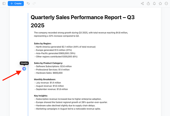
Here's an example sales report:
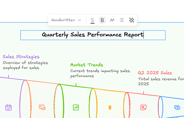
Quarterly Sales Performance Report – Q3 2025
The company recorded strong growth during Q3 2025, with total revenue reaching $4.8 million, representing a 22% increase compared to Q2.
Sales by Region:
• North America generated $2.1 million (44% of total revenue)
• Europe generated $1.5 million (31%)
• Asia-Pacific generated $900,000 (19%)
• Other regions contributed $300,000 (6%)
Sales by Product Category:
• Software Subscriptions: $2.6 million
• Professional Services: $1.4 million
• Hardware Sales: $800,000
Monthly Breakdown:
• July revenue: $1.4 million
• August revenue: $1.6 million
• September revenue: $1.8 million
Key Insights:
• Subscription revenue increased due to higher enterprise adoption.
• Europe showed the fastest regional growth at 28% quarter-over-quarter.
• Hardware sales declined slightly due to supply chain delays.
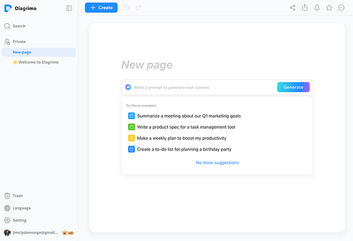
• Marketing campaigns in August led to a noticeable revenue spike.Paste the sample text on Diagrimo and click on the visualize button on the left side.
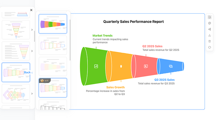
In less than 10 seconds, the tool will generate a bunch of sample illustrations customized based on the data you provided. It usually offers a few different layout options, so do not just settle for the first one you see. Browse through them and choose the one that tells your story best.
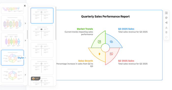
Once you pick a layout, you can adjust the colors and illustration style. This is a great feature if you need to match a specific brand identity or presentation theme. You can switch from a colorful, creative style to a more muted, professional corporate look with just a click.
After making several adjustments to the styling and color combination, here is what the final illustration looks like.
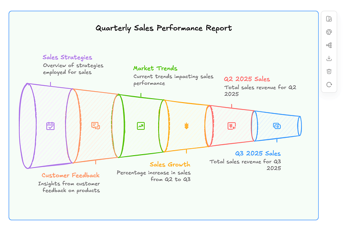
One thing I really like about this tool is that it does not lock you into the AI result. You can manually change the text, the font size, colors, and other elements. The AI gets you 90% of the way there, but that final 10% of manual tweaking is what makes the diagram truly yours. The tool gives you a lot of control, so feel free to experiment.
Let's do another one to show the versatility. The first example was data-heavy, so let's try something that is more process-oriented.
Here is text for a guide on launching an online course.
Beginner's Guide: Launching an Online Course

This guide explains the complete process of creating and launching an online course, from idea to first sale.

Step 1: Choose a Course Topic
Identify a problem your audience is actively trying to solve. Validate demand by researching keywords, online forums, and competitor courses.

Step 2: Define Learning Outcomes
List 3–5 clear outcomes that students will achieve by the end of the course. These outcomes will guide your content structure.

Step 3: Create a Course Outline
Break the course into modules and lessons. Each module should focus on one major concept and build logically on the previous one.

Step 4: Produce Course Content
Record video lessons, write supporting materials, and create practical exercises. Keep lessons short and focused.

Step 5: Select a Course Platform
Choose a platform to host your course, such as a learning management system or course marketplace. Set pricing and access rules.

Step 6: Launch and Promote
Publish the course and promote it through email newsletters, social media, and partnerships.

Step 7: Gather Feedback and Improve
Collect student feedback, track completion rates, and update lessons to improve quality and engagement.

Key Tips:
 • Focus on clarity over perfection
 • Use real-world examples
 • Update content based on learner feedback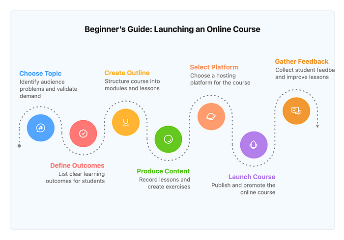
Notice how the AI adapts here. Since the text is structured as a step-by-step guide, Diagrimo skips the pie charts and bar graphs. Instead, it offers flowcharts, timelines, and roadmaps.
It understands the logical flow from Step 1 to Step 7. This is perfect for educational content where you want the reader to visualize a journey rather than just read a list. The AI automatically connects the nodes in the right order, so you don't have to manually draw arrows or align shapes.
The Benefits of Having an AI Diagram Generator
The biggest benefit here is obviously speed. It removes the friction of starting from a blank canvas, which is where most people get stuck.
It also ensures your data is structured logically. Since the AI understands the context of your text, it chooses the format that makes the most sense. If you have a process, it gives you a flow chart. If you have a hierarchy, it gives you a pyramid or tree map. You don't have to guess or maybe make a mistake on deciding which chart works best.
Finally, it allows for easy exporting. You can export your final work as a PDF or image file for presentations or collaboration.
Diagrimo Pricing
Diagrimo is largely free to use. You will receive a daily allowance of free credits, which is sufficient for regular usage.
If you want to use the tool regularly, you might want to consider upgrading to a $9.99 per month subscription. You get a 30% discount if you choose to upgrade to the yearly plan.
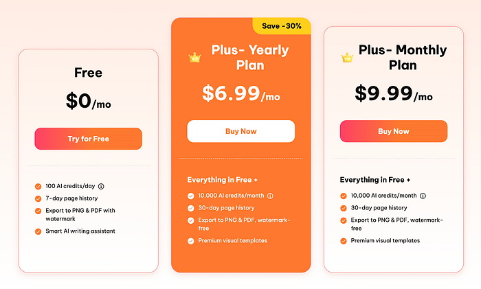
Also, aside from higher credit limits, paid users get early access to new features, longer page history, and priority support.
Final Thoughts
It is so cool to be able to instantly create high-quality illustrations from merely uploading your text data. The process is fast, and the tool gives you a bunch of creative controls to achieve something awesome.
Will it replace traditional tools like Canva or PowerPoint? It is not definite right now, but if the bigger guys do not catch up, AI tools like Diagrimo will surely eat their cake.
Diagrimo is actively improving with new and upcoming features.
- More powerful AI visualization. This is backed by a pioneering LLM with trillions of parameters for smarter understanding and higher-quality templates.
- A larger and richer template library. This is designed to fit every scenario and use case.
- Team collaboration features. This will boost productivity and reduce communication overhead.
Let me know what you think about this new AI tool. If you know similar tools like Diagrimo, feel free to share them in the comments.

This story is published on Generative AI. Connect with us on LinkedIn and follow Zeniteq to stay in the loop with the latest AI stories.
Subscribe to our newsletter and YouTube channel to stay updated with the latest news and updates on generative AI. Let's shape the future of AI together!
