
Future of UX design
Anthropic has just announced Claude Design. Pushed to production on a Friday.
This is their own, Claude powered design tool. Think of it like Google Stitch, but running on Opus 4.7.
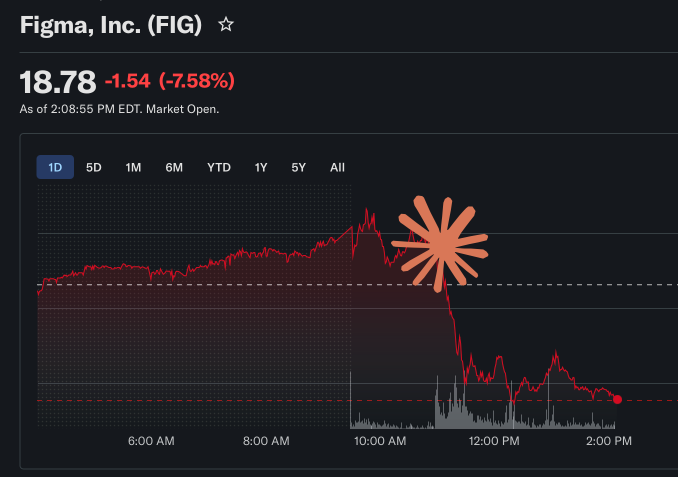
Is it a Figma killer?
The stock market definitely seems to think so, but we need to chill and learn to not mistake noise for signal.
We had a lot of tools that were supposed designer-killers in the past, so in this case Anthropic is making a moderate claim of:
make prototypes, slides, and one-pagers
This is important, because it doesn't claim to be a replacement for designers. Some people just need a simple, visual prototype.
Others a one-pager template. A presentation.
Is it skilled designer level output though?
No.
Was Microsoft Designer that? Google Stitch? Template monster?
No. No. And No.
But that's not the point.
I'll walk you through my exact thoughts, who is this for, who it's going to replace and what it all means, but first we need to address the two fat elephants in the room.
But before we do, have you noticed how the font of the word Design is thicker than the icon next to it? Heavier? Feels weird, right? Like the icon is not matching.
Feels out of balance. I know it's almost half the thickness, so not random, but branding needs to feel right.
This feels low effort.
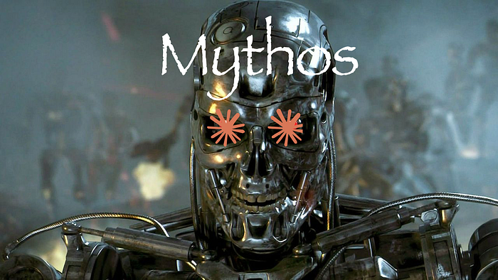
AI industry runs on hype trains
Frontier AI companies are not making enough money. They're losing money. Investor money. And they desperately need the attention.
Yours.
This is why you hear Mythos doing almost Skynet like feats. This is why OpenAI launched and then killed the Slop factory "Sora". You need to be constantly present in the media.
Feed the hype! Have them all talk!
But the problem here is that if you worked with Claude Code before, it already has some design sense. The UI's it generates are not that much different from what Claude Design generates.
So this tool is some extra .md files wrapped in a shiny "new" product that can make Figma stock go down. That makes headlines, people talk about you, investors feel the innovation go Brrr.
But in reality, this is the same Claude Code you used for the last year.
Which brings us to the main thing.
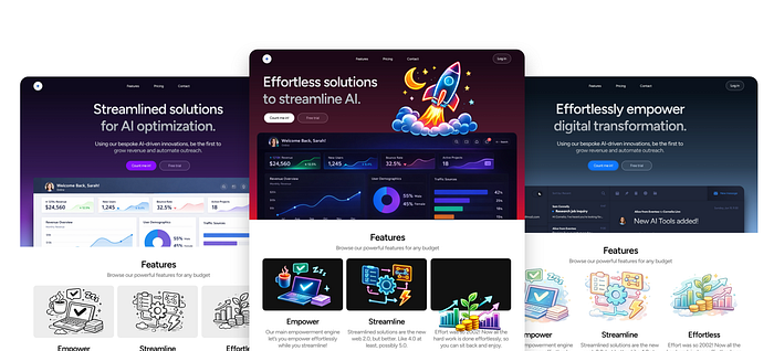
Design quality is not substantially better
There's some cool examples in the presentation. But you know what? Stitch had some cool examples too. And once you got to use it, the real results weren't as impressive.
Even Microsoft Designer all those years ago showed some shiny looking outputs, and we all know how that turned out.
Rails on rails on rails on
When making a presentation of a generative anything, you usually don't just run it on some random idea. Or ask the live audience for one.
No, you test a lot of prompts first, based on a couple of characteristics of what non-designers will consider "good design". All of it is animated with nice zoomy transitions, sound effects and whooshes.
It's like a magic show. Look at this hand, because I'm doing a trick with my other hand.
Impress the masses
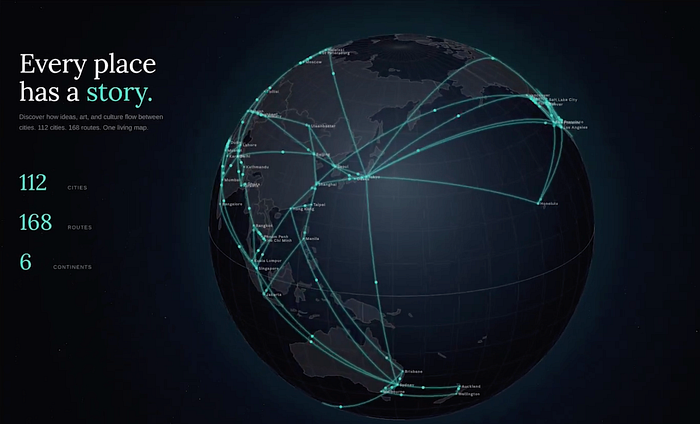
I am not surprised the first generative thing is a 3d, rotating globe with lines connecting places. It also says "Every place has a story".
It ticks all the generic boxes of what regular people expect "a cool" design to be. 3d? Check. Complex looking animation? Check. Serif font? Check.
Blue and purple gradient? A-ha! No slop colors, so it must be good, right?
See how well thought out WHAT to show you really was here?
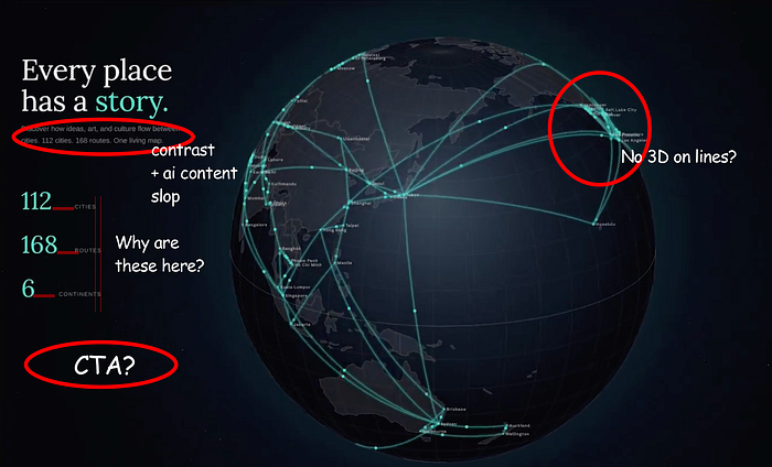
But then you look closer and the lines are just a flat texture on the globe. Long term unreadable. There's some odd positioning of labels. Not enough contrast. And the description text has a typical AI written rhythmic pattern.
Also, don't look at the design, look to the left. It generates .jsx files. Yes, people! We have React in the house! Which is basically the exact same thing if you typed this SAME prompt into regular Claude code.
So I have.
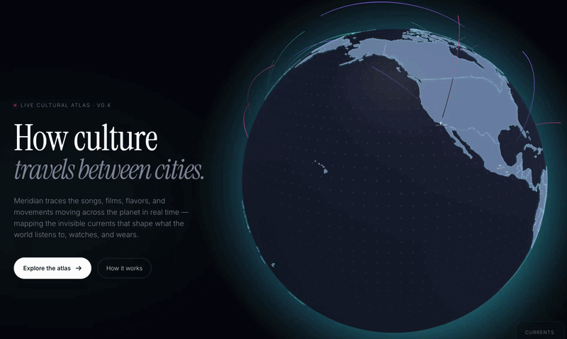
I gave it some clarifying prompts after that, but it's practically one-shotted and some parts of it are actually better than that presentation. And it's done by regular Opus 4.7 Claude Code.
Sure, the descriptions and kickers are still not contrasty enough. H1 is ugly. But overall it's the exact same ballpark.
And guess what? My lines are actually animated AND in 3d, not just a texture glued on top of the globe. And it's the same default prompt. See how you're being played here?
You had this tool for months already!
Same old, same old
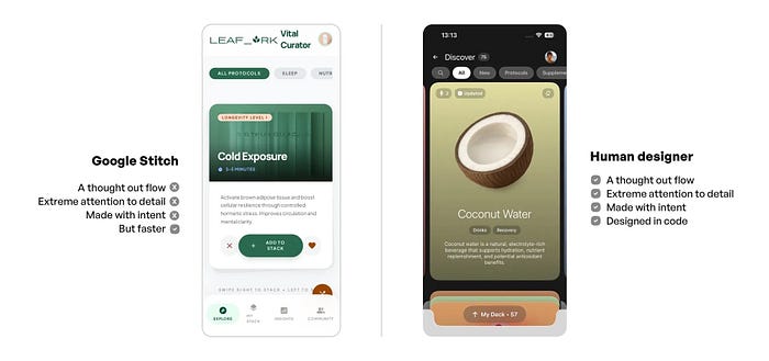
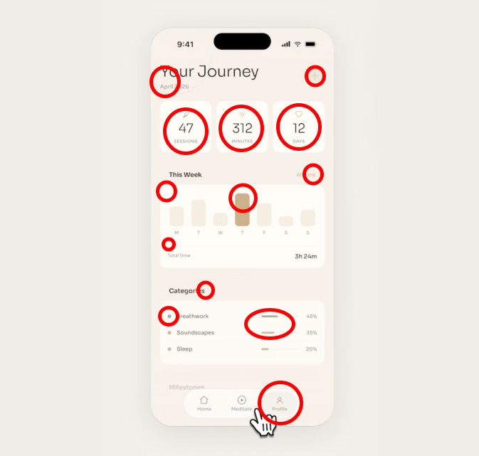
When you think about it that way, you realize it's nothing new. It's exactly the same with the mobile meditation app example. It's a safe, template'y, soulless generism. It's not specifically better or worse than what Google Stitch generates.
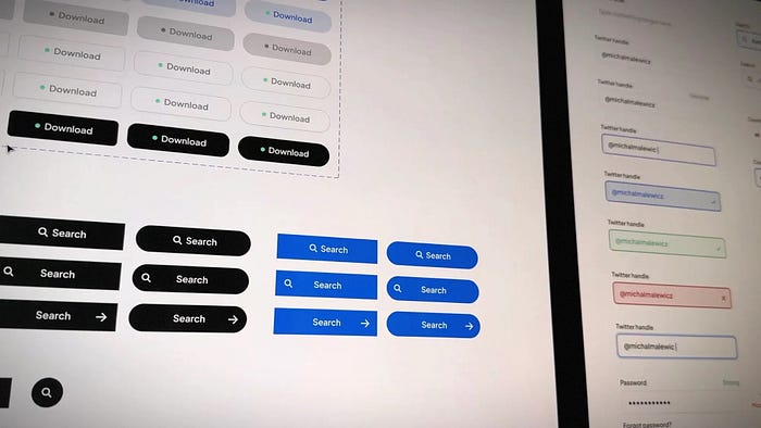
It's basically all templates. Safe, predictable, systemic.
Assembling in real time in code, just like regular Claude has been doing for a long time now.
Template Monster called
Back in the early 2000s, if you wanted a website fast and cheap, you went to template sites. Many of the templates were literally $30, so similar to your current AI subscription.
They were also often configurable, so you can flip the fonts and colors. Deploy and have a forgettable website in minutes.
Templates are still a thing. People build them for Webflow, Framer, Wordpress.
The main difference is how you access them. Until not so long ago, you had to search for the template, pick one from a list, pay and download. Which means it worked a little like a search engine and a catalogue.
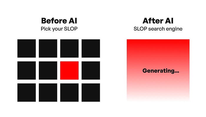
AI Magic?
What is AI in all this? I believe it's the same search engine, hidden under the false impression that you, as a user, are in control. You don't search anymore, but instead you tell it what you want.
It doesn't matter most people aren't 100% sure what they want. Let's also not talk about people hoarding prompts from others, because they're too lazy to describe what they want themselves.
I made this experiment a while back, giving the prompt away for free, then adding "Comment PROMPT if you're stupid" and seeing over a hundred people write PROMPT under it. Yet the prompt was already there.

Who's the maker?
The main difference of these new AI models is the perception that you're a creator. Not just picking a template from a list, actively "making one". But in a way, it is still picked and compiled from a large list of things the models trained on. It's still a template, assembled on a set of rules built into .md files.
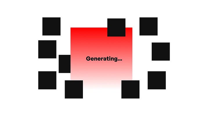
There's nothing creative in this process, just as there was nothing creative in downloading templates in the past.
Figma killer?
Yes, you can easily click on objects and modify their properties here. So it's a bit like Figma and Canva for non designers. You can edit stuff.
But if you're not a designer, how do you know if that edit is any good? Or better yet, how do you know your "original" generative work is good?
Just because Claude Design said so? Sure, it's enough for some non-designers to be able to output non-horrible work. The outputs of these tools are "okay". Not great. Not terrible.
But is our bar so low now? Non horrible is enough? Really?
And people with no design budget already used much worse models AND templates. We may get slightly better output from them now.
That's a win.
But there's another level to it
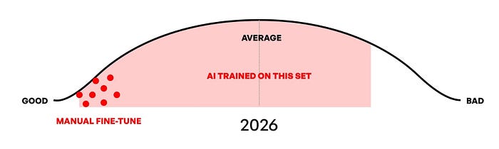
I've said this before, averaging design output means almost non-existent really badly designed products. But that inflated middle-ground, that extra-average space is growing exponentially.
Which means soon, average design will not be your differentiator. Good enough will become NOT good enough quickly.
It won't be enough to beat your competitors. You will need someone with actual skills to push it into that craft, quality category.
Or you just drown in the ocean of sameness.
How many designers do we need?
Not as many as we have now. The field has inflated with components drag & droppers, and some pretty random people.
Tools like this, that works on systemic thinking, are a part of the shift I noticed two years ago. I got a lot of hate for it, and now, once again it turns out to be 100% true.
The end of design systems as we know them is closer than you think.
Systemic design work is becoming less important when systems can build systems.
If all you did is drag & drop components, try to be the top 1% of DS people out there. Otherwise you're already on your way out because AI is killing design systems work.
It's just stacking boxes. Simple enough for algorithms to do.
But design is more than just stacking boxes.

The way out is…
I believe half of the designers will have to switch to something else. Mostly those with zero actual passion and love for design. Those satisfied with doing repetitive, boring work for years. Those using the same few solutions to solve all UX problems.
But if you're a curious designer, not afraid to step out of your comfort zone, these are all just tools and templates.
Repeat after me:
Tools and templates.
When you say it like that it becomes a lot less scary.
Claude Design is not a Figma killer. It's not an industry killer. It's the same Claude Code, averaging design frontend, wrapped in a new, shiny foil.
That's because FOMO and hype are what drive the AI industry.
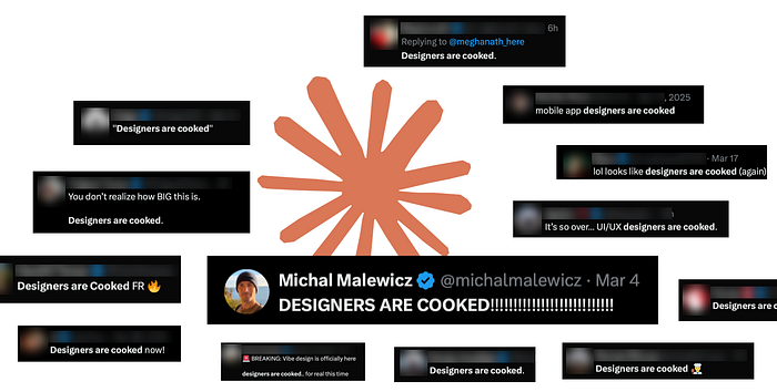
Who's cooked now?
They need to constantly "cook someone".
Without that constant pressure, regular people may not get the incentive to hop onboard and start paying.
I'm not anti-AI.
I use Claude Code daily. But I don't feel like it's replacing anything. It's augmenting what I already know. Allows me to do some boring stuff faster, but I use that saved time to do things A LOT better. Not just faster.
And that difference of approach is exactly what matters.
Just tools.
I build beautiful wellness and longevity apps, yes, also using AI. Running the best website optimization tool out there. You can catch me on X or YouTube. No AI was used to write this article. It would be pointless. I write from the heart.